
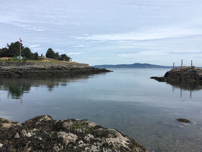
During the first week of June, I attended a week-long course at the Digital Humanities Summer Institute (DHSI) at the University of Victoria. Even in the airport, I encountered enthusiastic DHers from all over the country and at all different points in their careers/education. The course I enrolled in for the week was called Taming Treacherous Data: Ethical Data Visualization and was led by Katherine Hepworth and Chris Church, both from the University of Nevada, Reno. While I had encountered some of the concepts covered in the course, that singular classroom in the Cornett Building gave us the space—mentally, spatially, and temporally—to discuss complex, and often difficult, issues such as technology and racism, unethical and harmful visualizations, and the larger implications, and impact, visualizations can make on people and their decisions.
Tenets of Ethical Visualization
We encounter visualizations of data everyday in textbooks, subway ads, newspapers, and billboards. We also live in a world in which scientific facts, expertise, and what is considered reliable news is in question. The stories told with data, how that data is visualized, is more important than ever. The course was geared toward these issues and spent time not only on the reliability of the data used, but also on strategies for presenting it accurately and ethically—these include visual hierarchy, color, design, and line. A guiding principle for this work was the digital humanities equivalent of the Hippocratic Oath to do no harm. In order to learn how to create good, responsible visualizations we studied examples of misleading and/or poorly designed representations of data. This process was hands-on and required us to recreate “bad” visualizations and then repair them so that they communicated more clearly and honestly. This exercise emphasized two important lessons. First, a visualization need not set out to mislead or do damage but can still have those outcomes, highlighting the blurry divide between bad design and unethical visualization. Second, it is very easy to create a bad or misleading visualization with little effort.
Making Visualizations
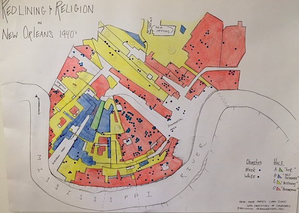
While students in the class were provided with “pre-baked” data, many participants brought their own data to work on during the week. A few weeks prior to DHSI, I had completed compiling a dataset from the 1941 WPA Directory of Churches and Religious Institutions, a copy of which I found in HathiTrust. The project, which culminated with an ArcGIS StoryMap, originated in a Digital Humanities class with Roxanne Shirazi taken at Pratt Institute’s School of Information. The WPA directory contains almost 800 churches and religious institutions, such as schools and community organizations, organized by denomination. The list was further subdivided into black congregations and white congregations. I wanted to use the DHSI course as a means of expanding the work I had already done by extending my efforts to include other data from the time period. Specifically, I was interested in reconciling my data with Mapping Inequality, a DH project from the University of Richmond. This project provides over 150 interactive maps derived from the Home Owners’ Loan Corporation (HOLC), all which “afford an extraordinary view of the contours of wealth and racial inequality in Depression-era American cities and insights into discriminatory policies and practices that so profoundly shaped cities that we feel their legacy to this day” (Mapping Inequality, n.d.). The long history of segregation in the south, as well as the complex history of race, religion, and economics in New Orleans—especially during the New Deal—can be difficult to understand. I felt that mapping could provide a way to understand the effects of systematic racism by seeing it spatialized across the city. I chose to focus on religious institutions because they play a major role in daily life in New Orleans to this day and because they were so clearly delineated by race. What became clear immediately was how concentrated black churches were in neighborhoods that the Home Owners Loan Corporation had ‘redlined’ (i.e. had labeled as ‘Hazardous’ or as a bad bet for home loans).

As part of the class, we were encouraged to draw visualizations by hand, which allowed us to engage with data in different ways. Indeed, drawing a map of New Orleans was time consuming, but it changed how I understood the city in which I grew up. The meaning behind the contours of the city became pronounced, hard lines between neighborhoods became more apparent. The so-called “worst,” “roughest,” most “hazardous” areas—to use language from the HOLC—like the Irish Channel, the Seventh Ward, and Central City are located along flood zones next to or near the Mississippi River. Sadly, these areas are still prone to flooding as Hurricanes like Katrina and Rita made abundantly clear. The population of poor, mostly black, people in these areas were (and are) not only vulnerable to natural disaster, but also to systematic discrimination based on that vulnerability.
The processes of making both the digital and hand-drawn maps allowed me to explore data in ways that were both broad (city scale, systemic) and deeply intimate (block-by-block, church-by-church). For me, this combination is intriguing as it allows for the collection of large-scale data to tell the stories of individual communities. It also provides the opportunity to confront the legacies of racism, the excesses of capitalism, and the power dynamics these imply in a manner that is hard to ignore.
I would like to thank the Digital Humanities Summer Institute (DHSI) and the University of Victoria for the generous scholarship that allowed me to attend this year’s gathering. Additional thanks goes to Ray Siemens and Alyssa Arbuckle for all of their hard work in organizing DHSI and to Chris Church and Katherine Hempsworth for their help and guidance throughout the week. Many thanks also go to the many DHers that I met at UVic, including Ravynn K. Stringfield, Mauve Pagé, Dr. Ella Howard, Serenity Sutherland, and many, many others.
I would like to acknowledge that UVic sits on the territories of the Lekwungen-speaking peoples. Please see the UVic territory acknowledgement for further details.
Post originally appeared in the NYARC Blog (June 2019)
